Visual Identity for Self Promotion
Personal Project, 2018
―This project seeks to create a cohesive visual identity, capable of communicating my professional and artistic work.
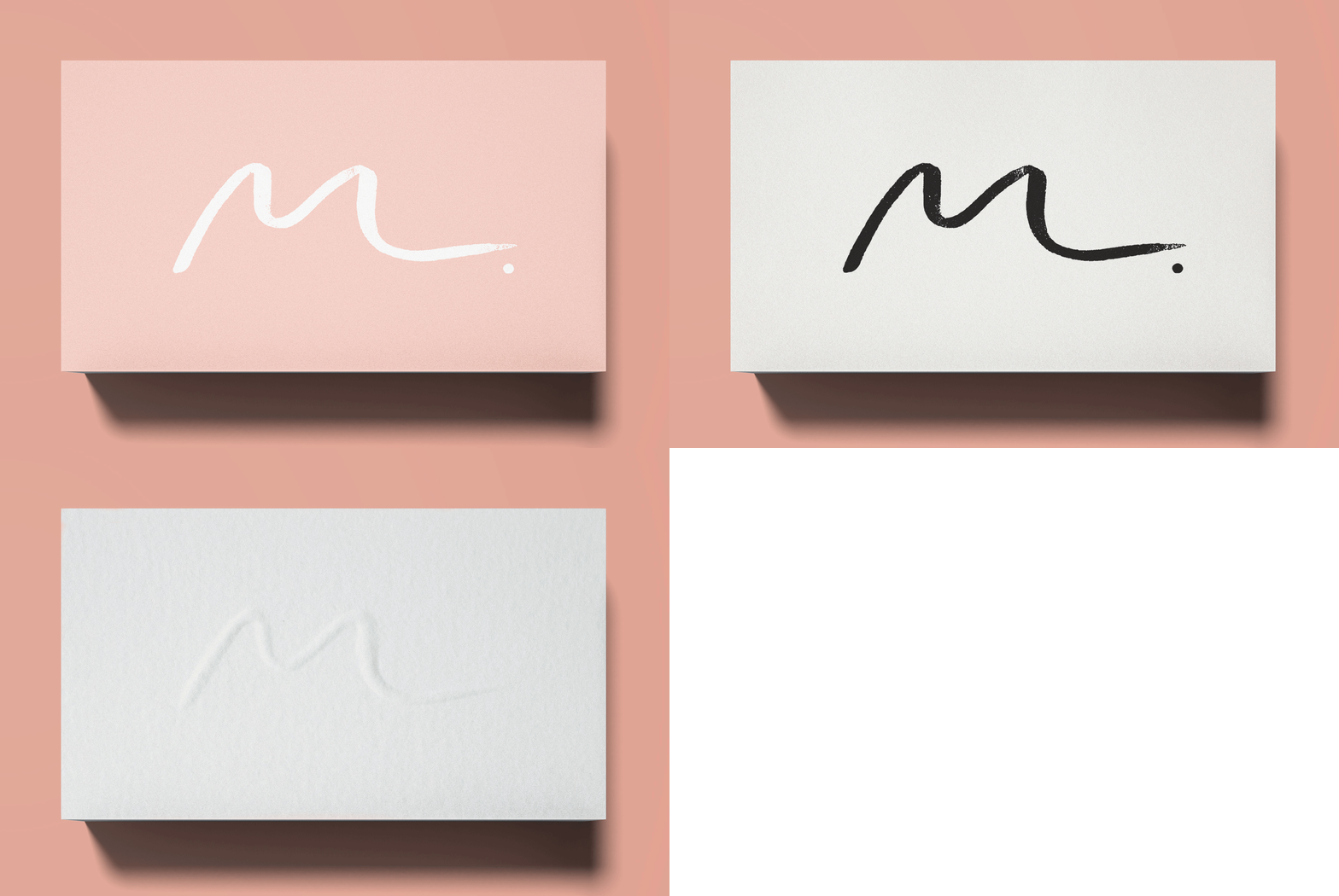
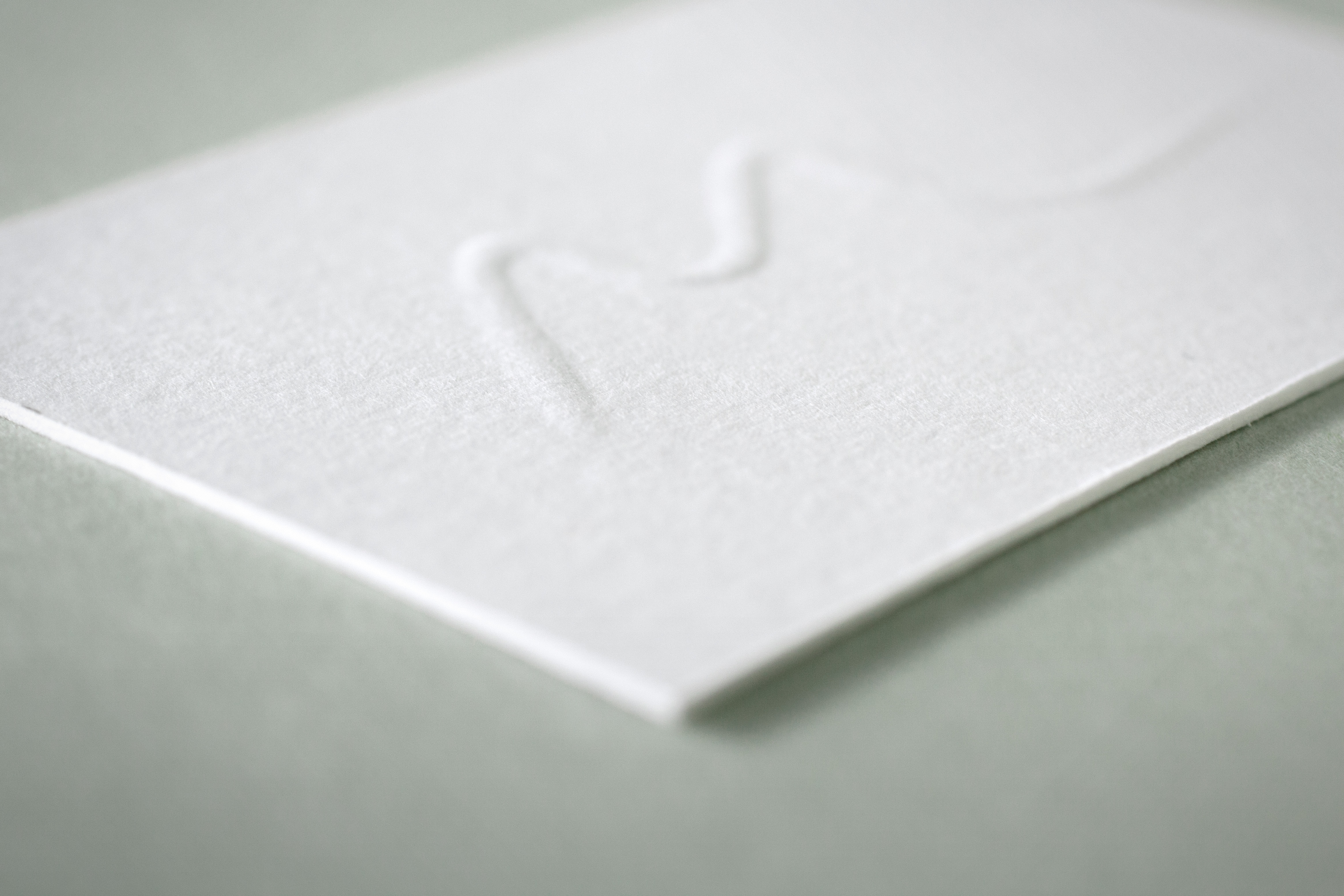
The organic shape of the letter "M" was, therefore, chosen as a starting point in the development of the logo. By using a single brush trace as signature, I tried to bridge two fields of interest: my passion for language and design and the free nature of drawing. In other words, two activities connected by the creative gesture of the stroke.
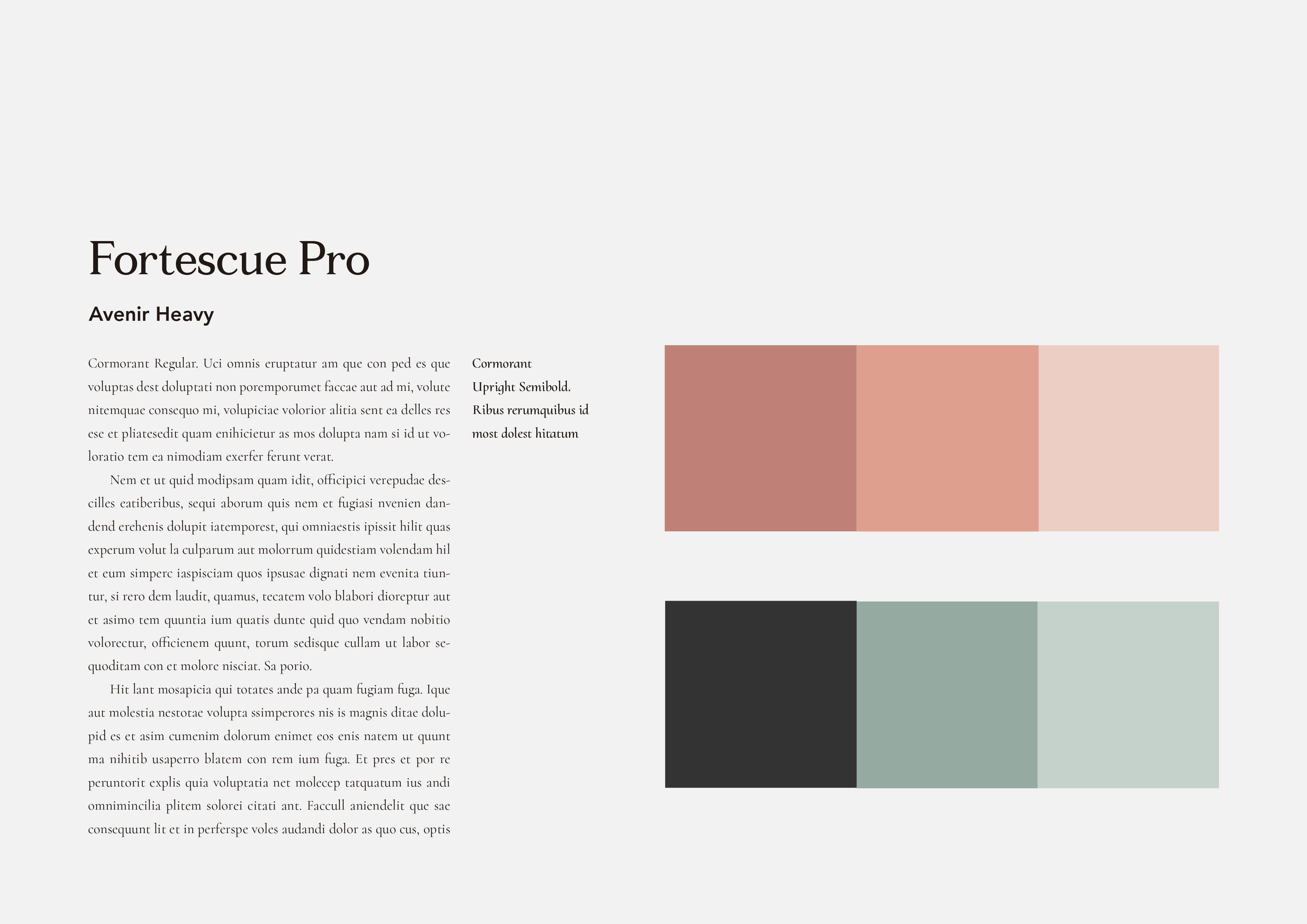
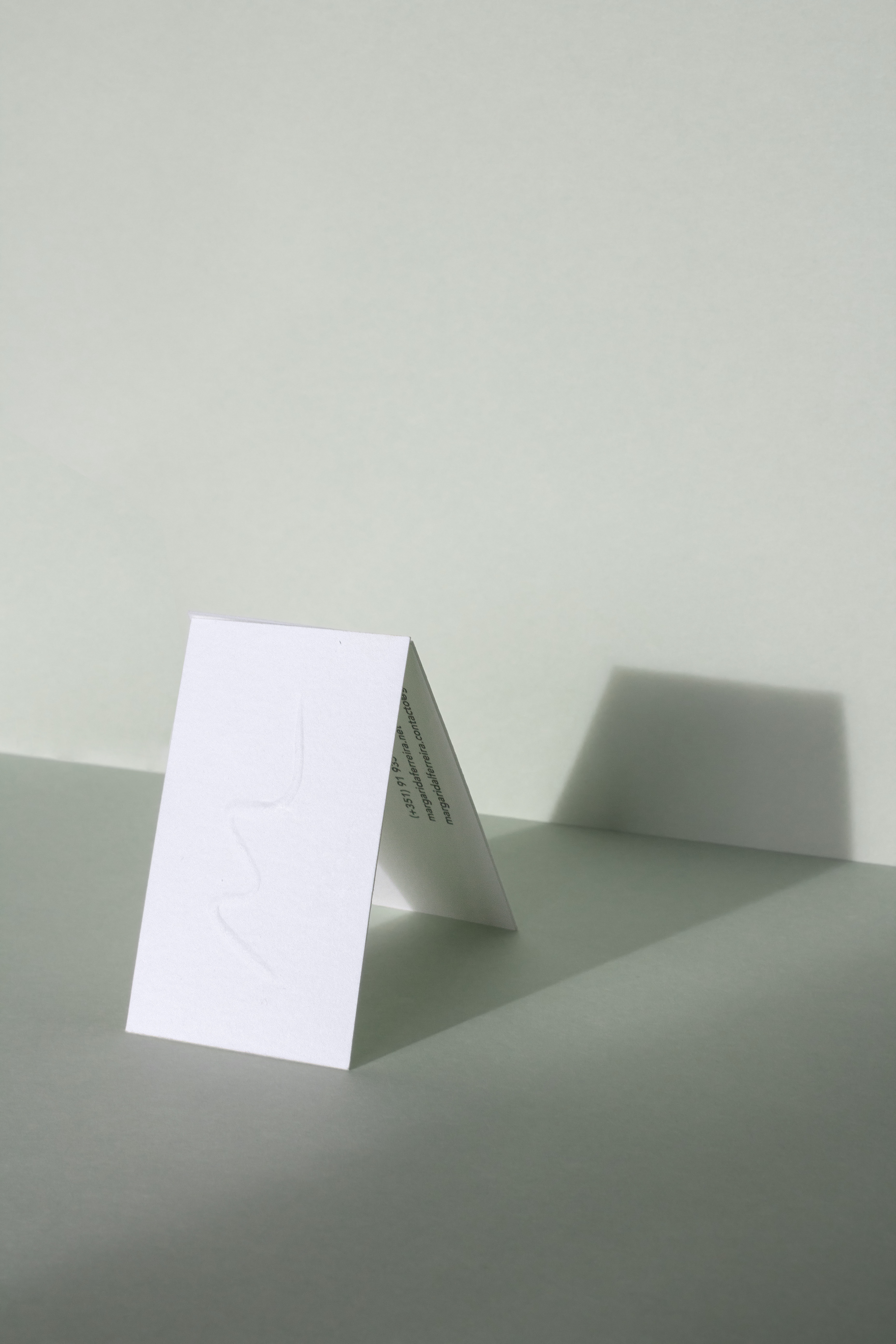
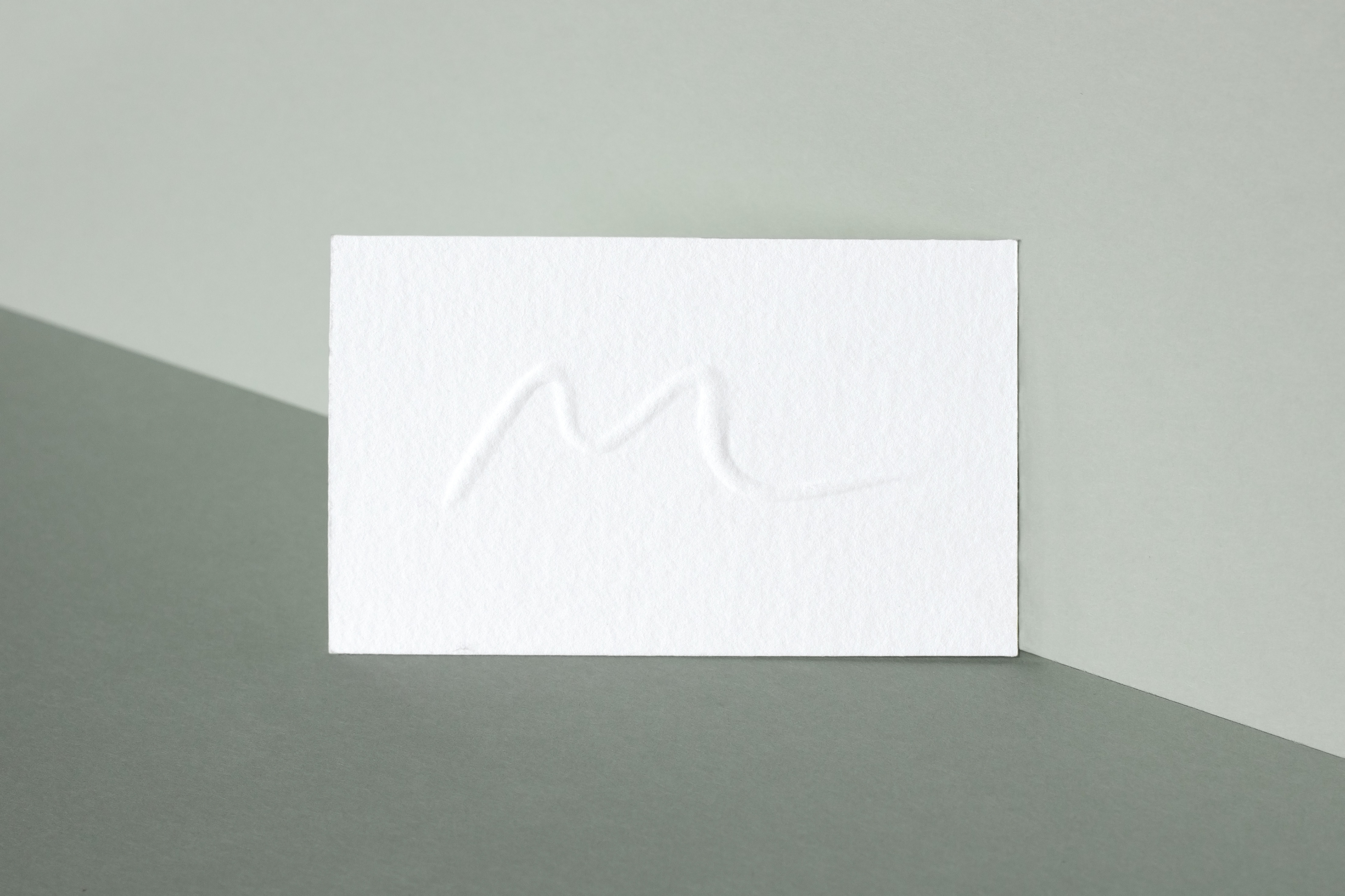
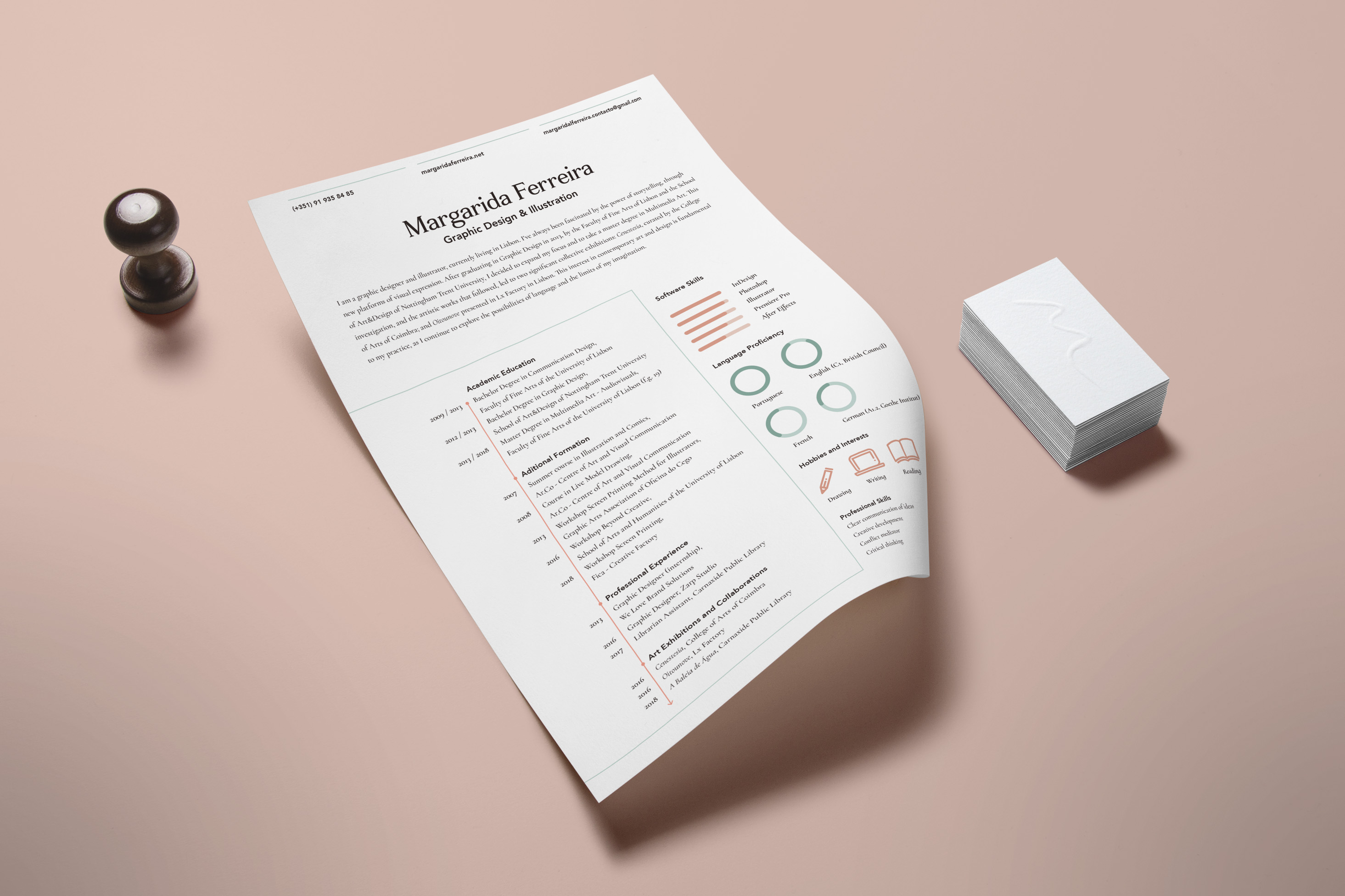
This approach allowed me to create a flexible visual identity. The first set of business cards was built from two layers of 250g/m² textured white paper, with the logo embossed on the front, giving the object a minimal look while retaining its tactile properties. To expand these ideas to other platforms, I also adopted a strict code of colors and typefaces. These guidelines would be especially useful when designing other promotional objects, such as resumés, motivational letters, and my personal website.
Branding
Visual Identity
Print Design
↥
Home
Home