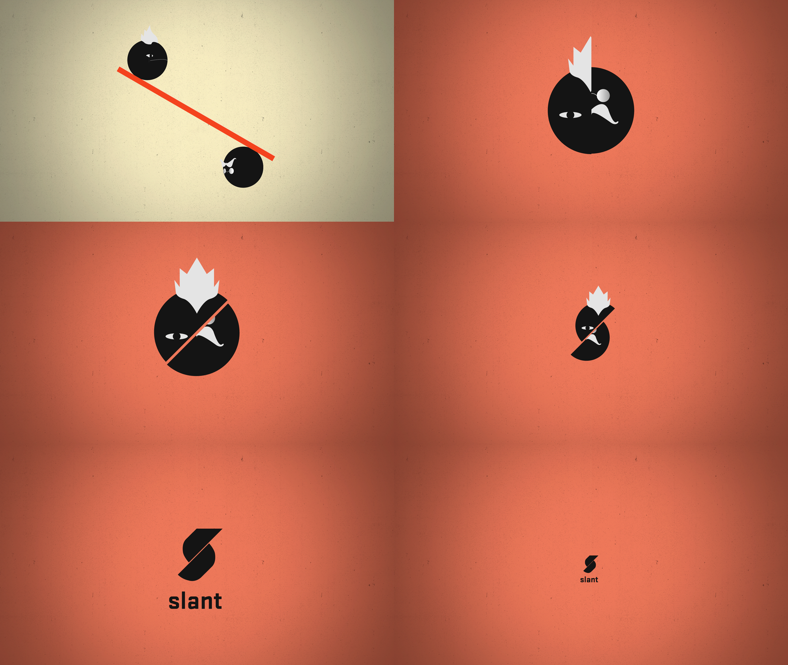
Slant Teaser Animation
Graphic Design (BA) Nottingham Trent University, 2013
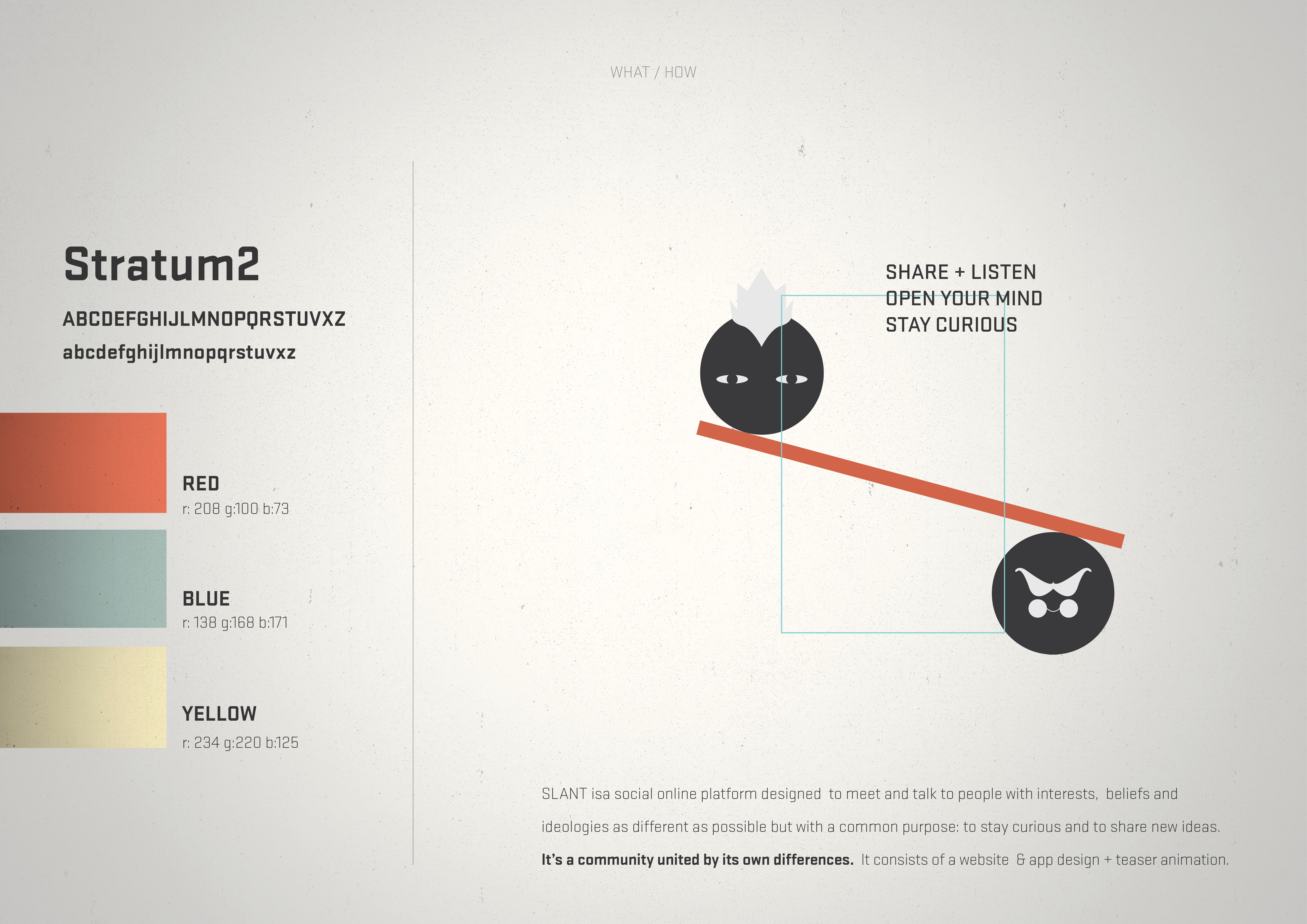
―For this project, we had to develop a visual identity and brand strategy for a fictional product, using only one key concept as a starting point. We would then have to establish its main public, structure, and goals; to create a name, logo, and cohesive visual communication for the brand; and to decide which platforms would be used to present this product to the public. Therefore, the idea of balance was chosen as the foundation of this work.
Since a state of balance involves, necessarily, a tension created by two equal opposing forces, I decided to explore this dynamic through a social media platform in which people with different tastes, interests and even ideals could share their opinions. In other words, through an online community united not by their similarities but by their differences. The name of the brand, Slant, is hence used to describe not only a natural state of unbalance created by a "slope or lean in a particular direction", but also the presentation of "(information) from a particular angle, especially in a biased way".
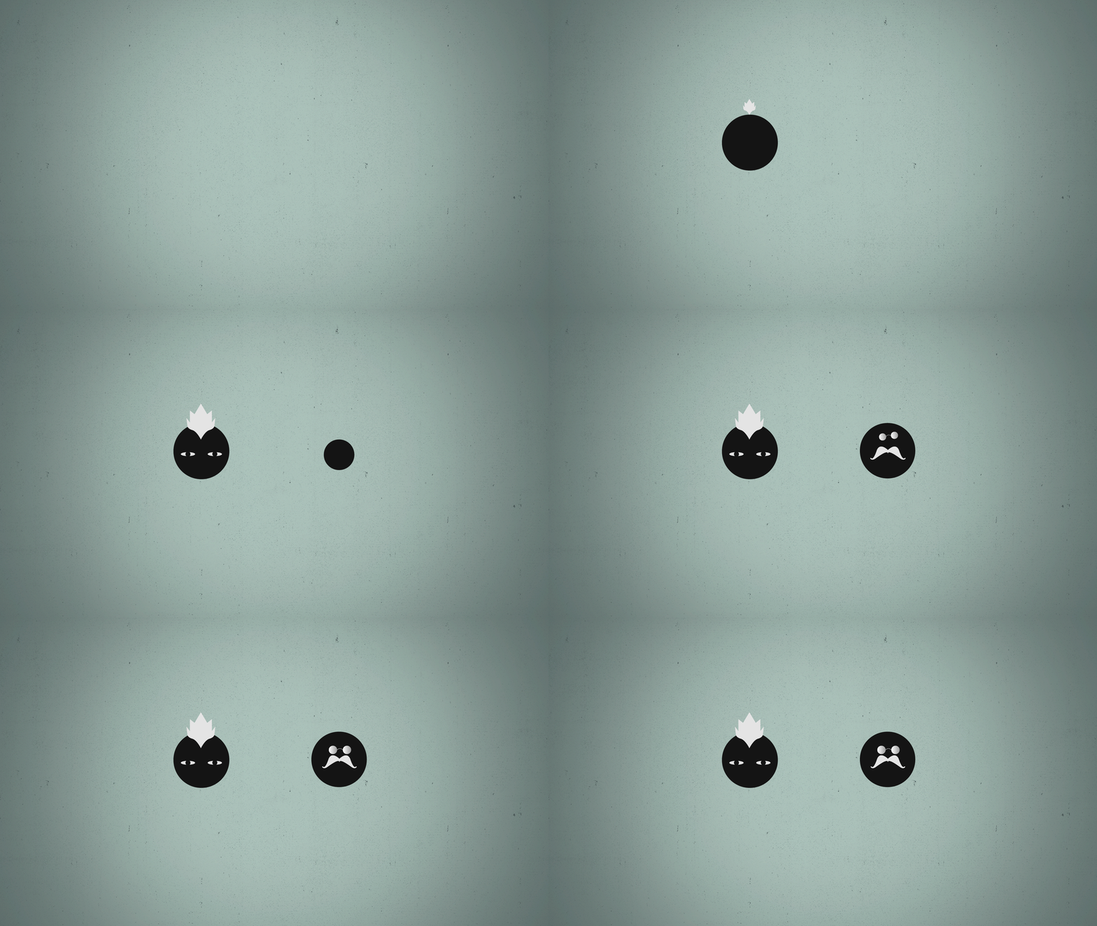
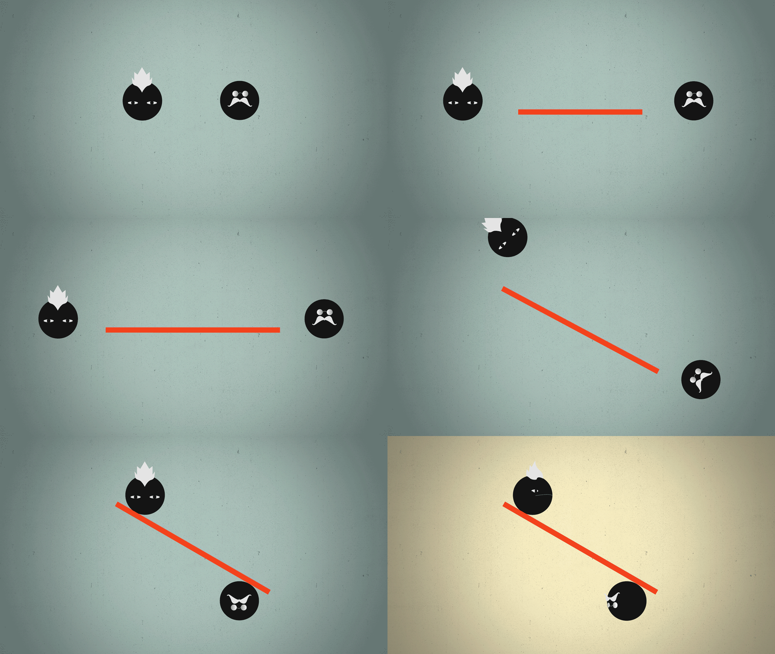
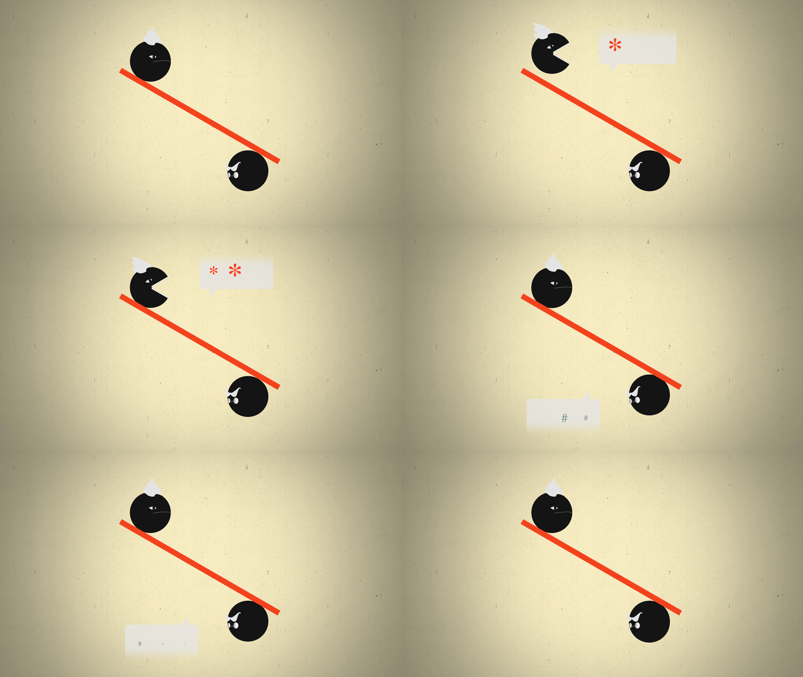
The brand was promoted through a digital teaser animation, as part of the communication strategy. This sequence explores two contrasting figures, involved in a playful game of discussion, resulting in the creation of the company's logo: an "S" formed by two semi-circles, using the Stratum 2 typeface as complementary typography. The illustrations were designed in Adobe Illustrator, while the motion graphics were modeled in After Effects and edited in Premiere Pro.
Branding
Visual Identity
Motion Graphics

