Pianoforte Typeface
Communication Design (BA) University of Lisbon, 2013
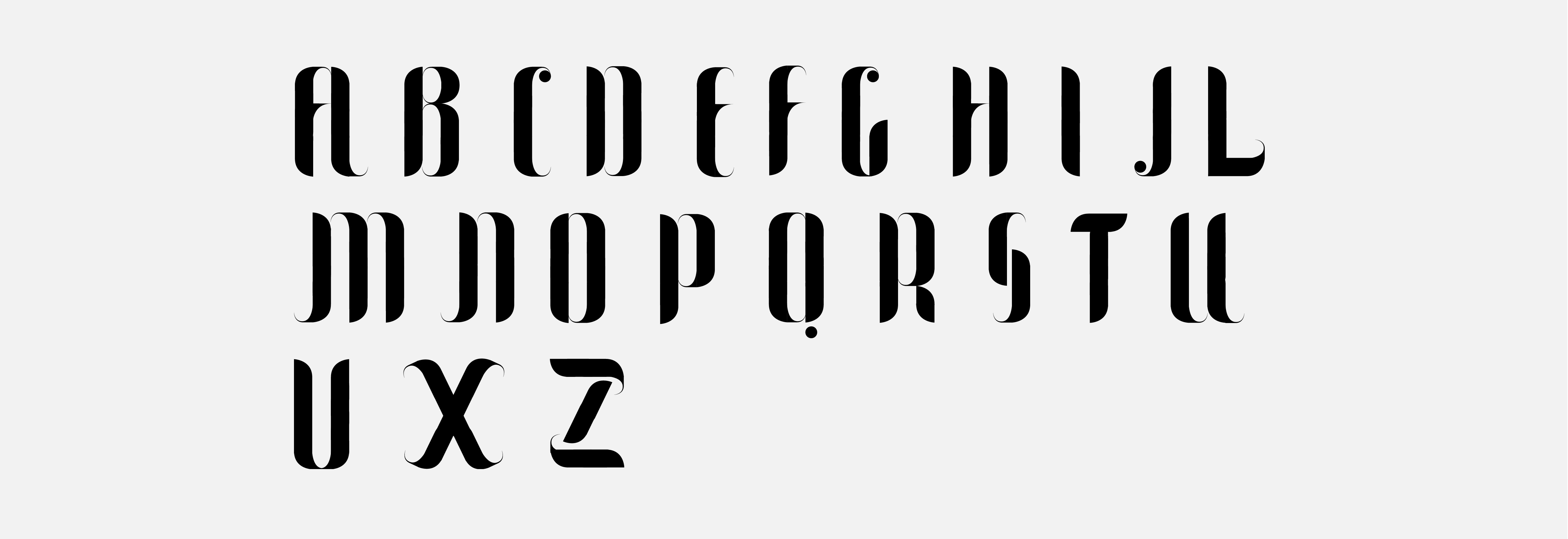
―Pianoforte is a modular and high contrast typeface, that combines the precision of its geometric parts with the elegance of its design. For this project, we were challenged to create a font using only three elements that could be "rotated, mirrored or overlapped" but not "cut, resized (...) or deformed".
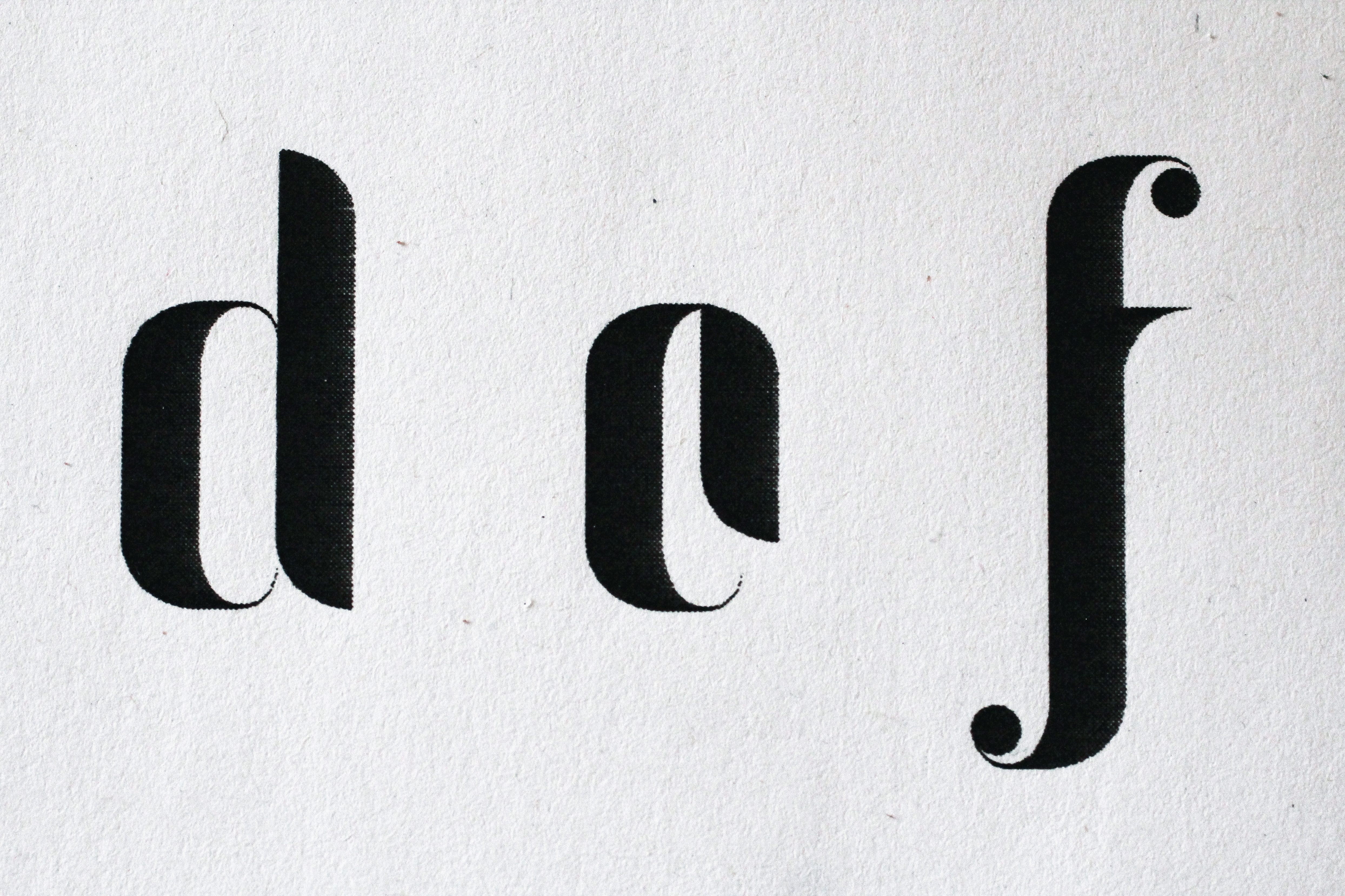
The name Pianoforte is a direct reference to the Italian terms used to describe the dynamics of musical scores: "piano" indicating a faint sound, and "forte" a high-intensity one. This sharp contrast can also be translated into the design of the characters, using extreme variations of the stroke combined with bracketed serifs and ball terminals. Other visual parallels can be drawn between this typeface and elements of the musical universe, as is the case of the slender f-holes in violins or the markings of "forte" used in musical notation.
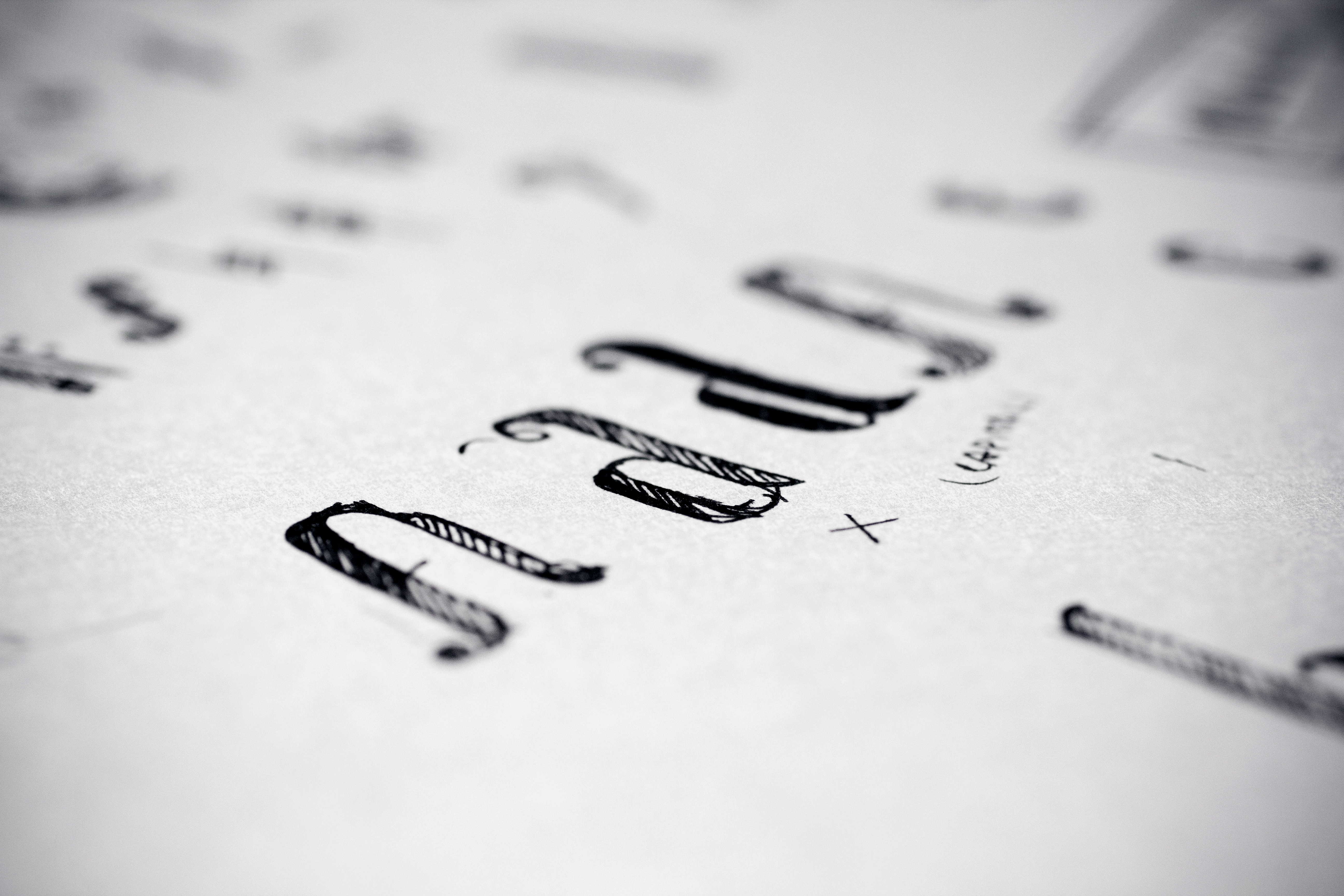
Created in Illustrator and edited in FontLab, Pianoforte is specially designed for titles and includes the complete English alphabet, without punctuation (since it was impossible to create the remaining glyphs with only three modules). The font was converted in Open Type and True Type format.
Typography


